
Project date April 2024
Designing a fictional future brand and its campaign
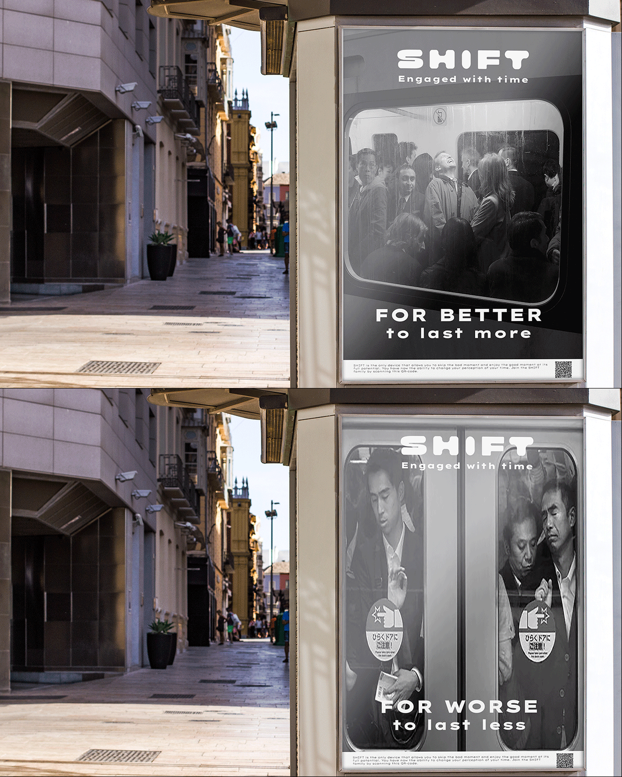
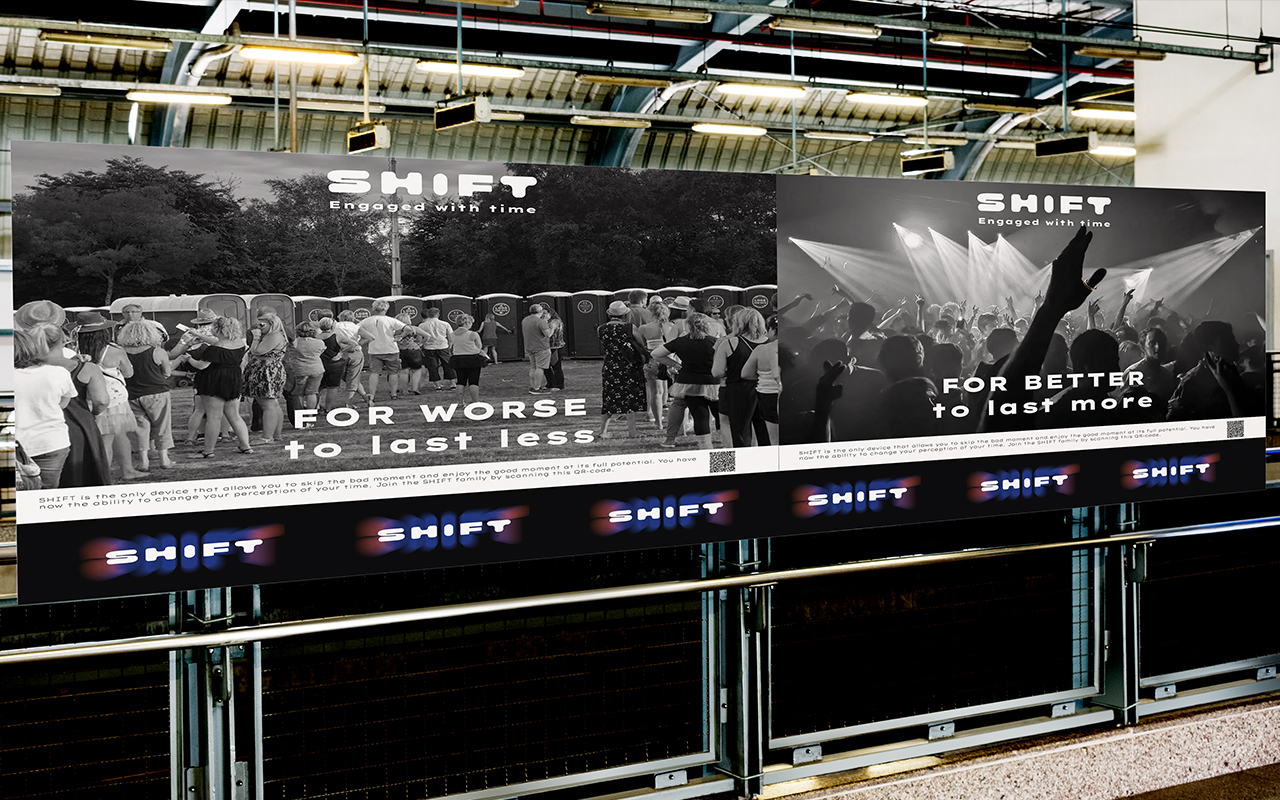
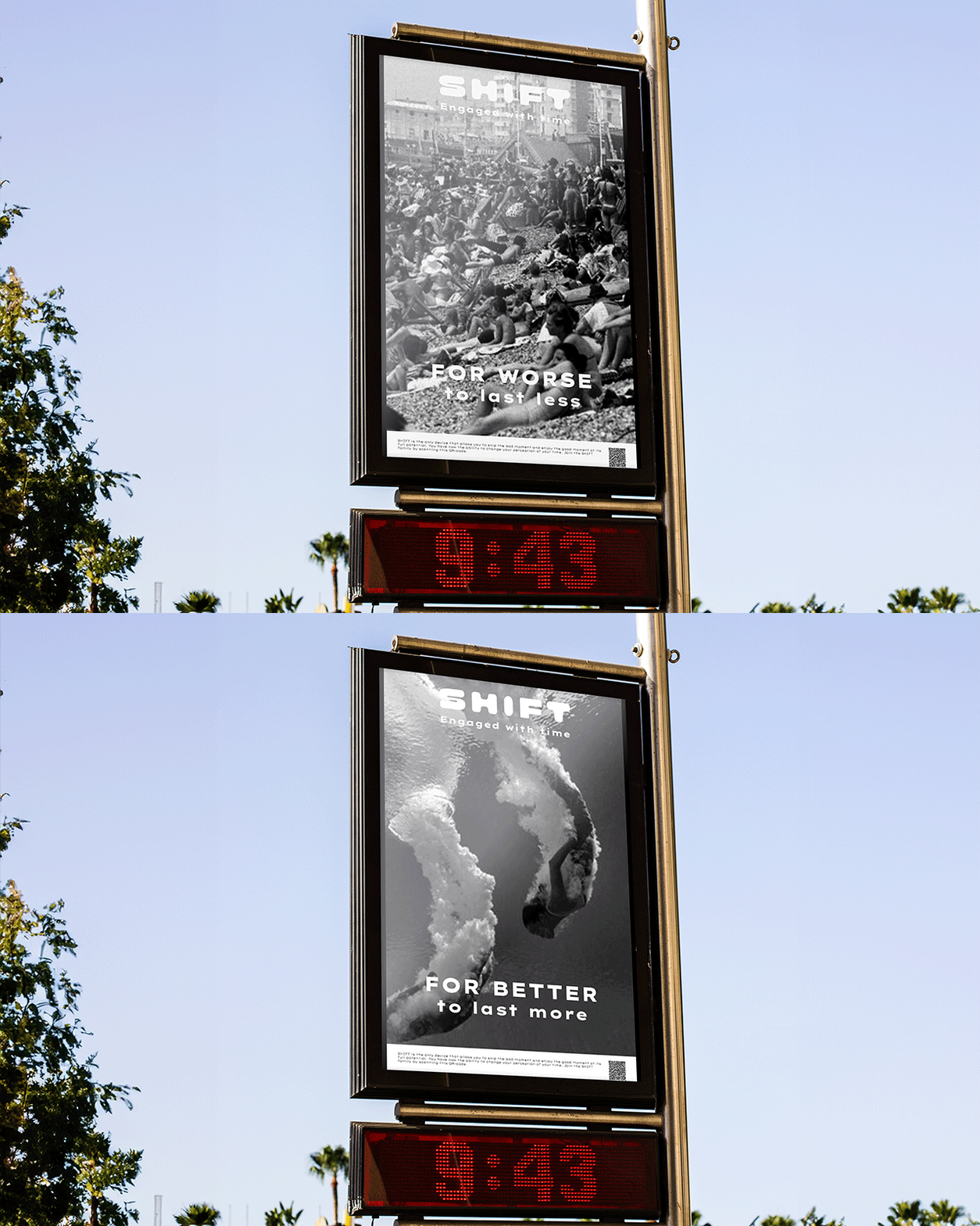
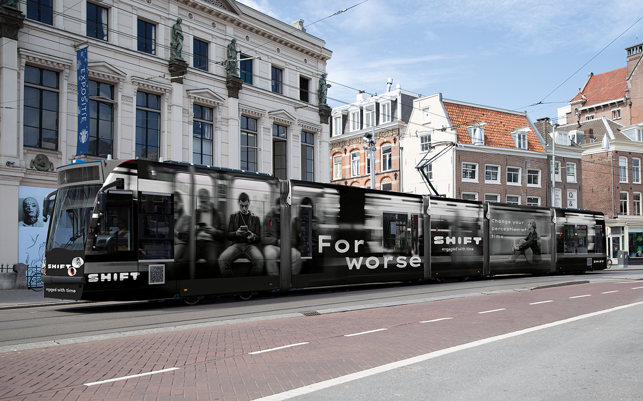
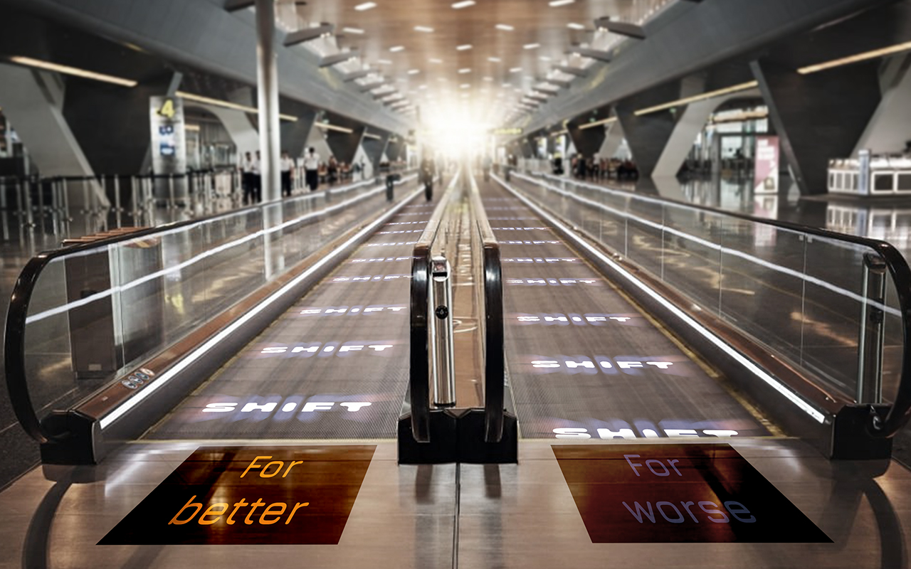
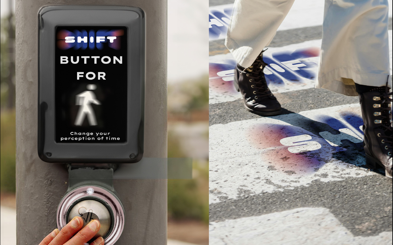
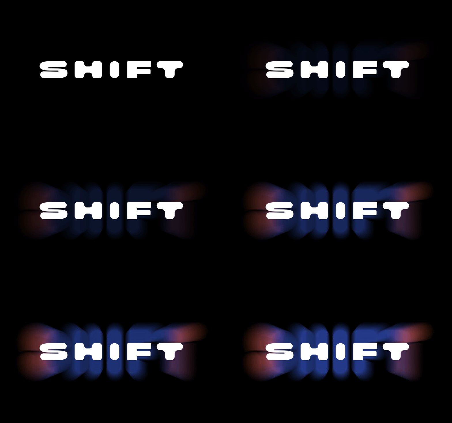
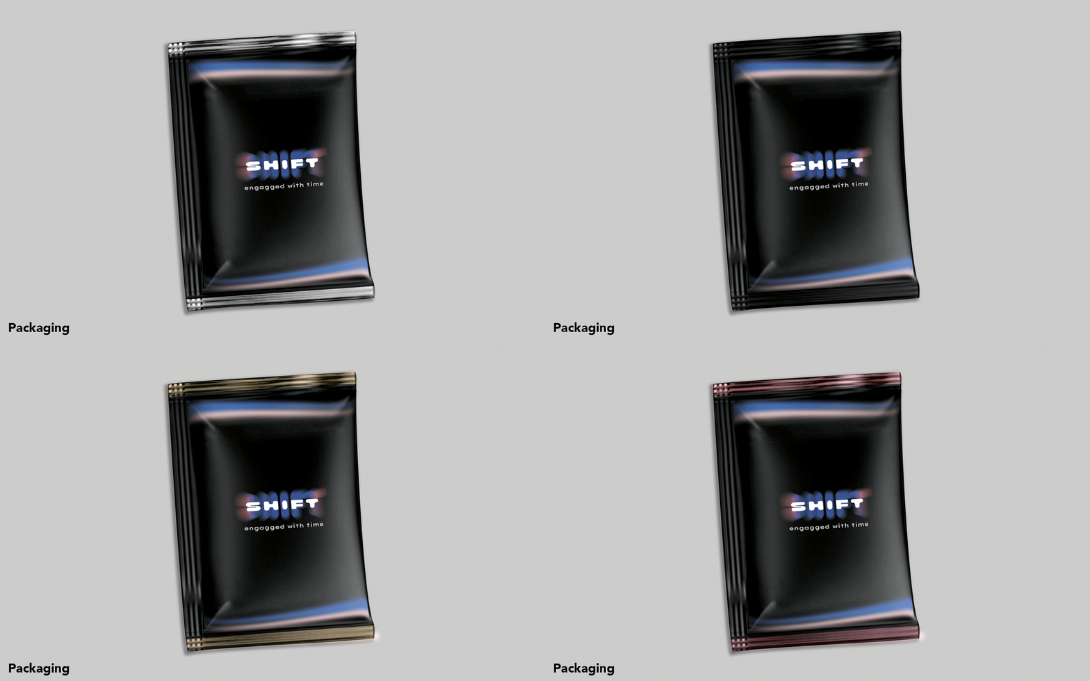
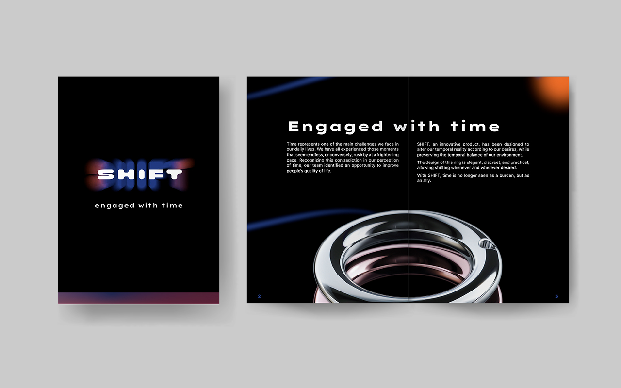
We selected a modern and bold font to give the brand image a raw and contemporary feel. This approach is also reflected across our various materials. Additionally, we incorporated a temporal aspect by using color gradients and blurs, symbolizing a slowdown or acceleration of time.
Project date May 2024
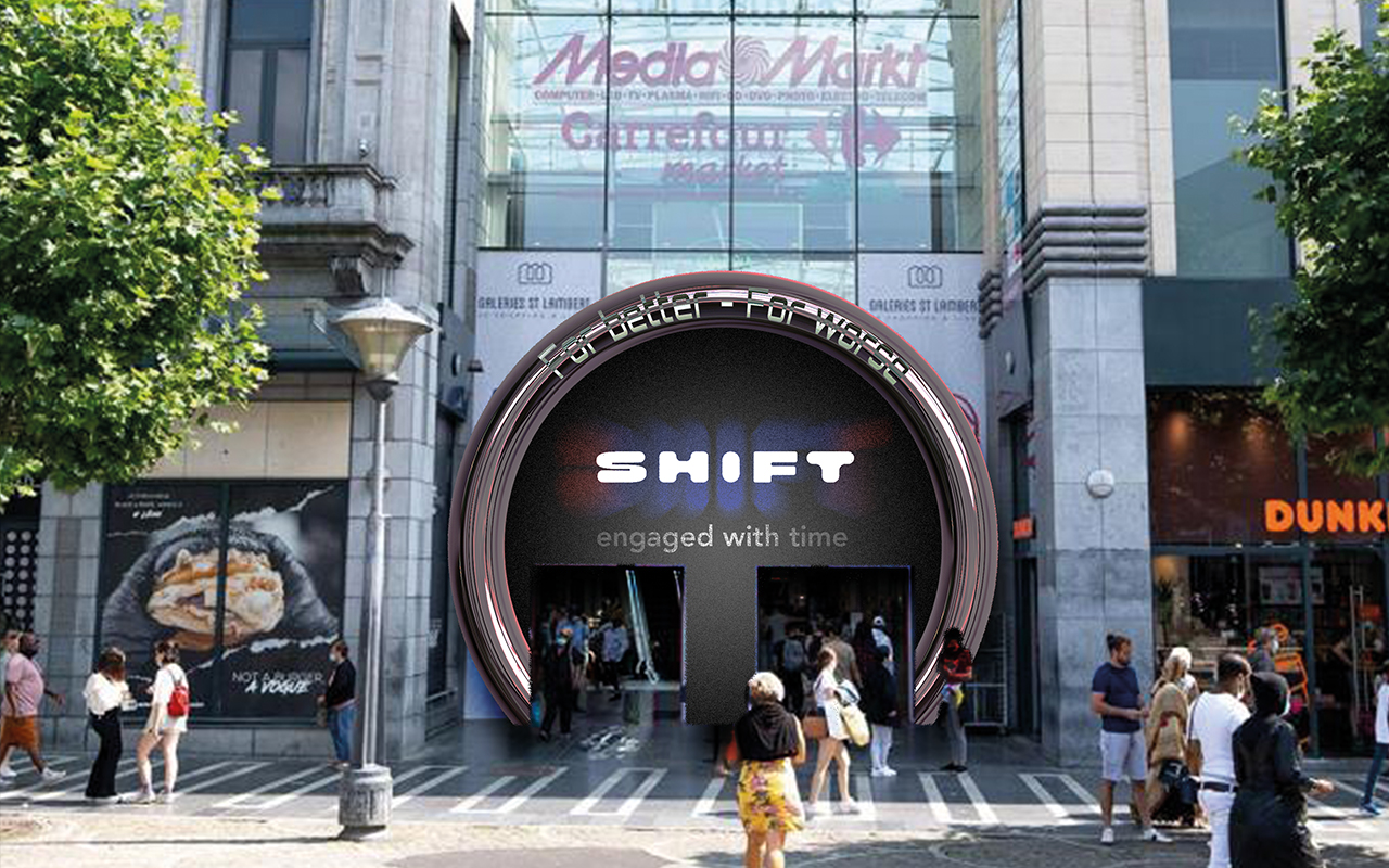
For better and for worse
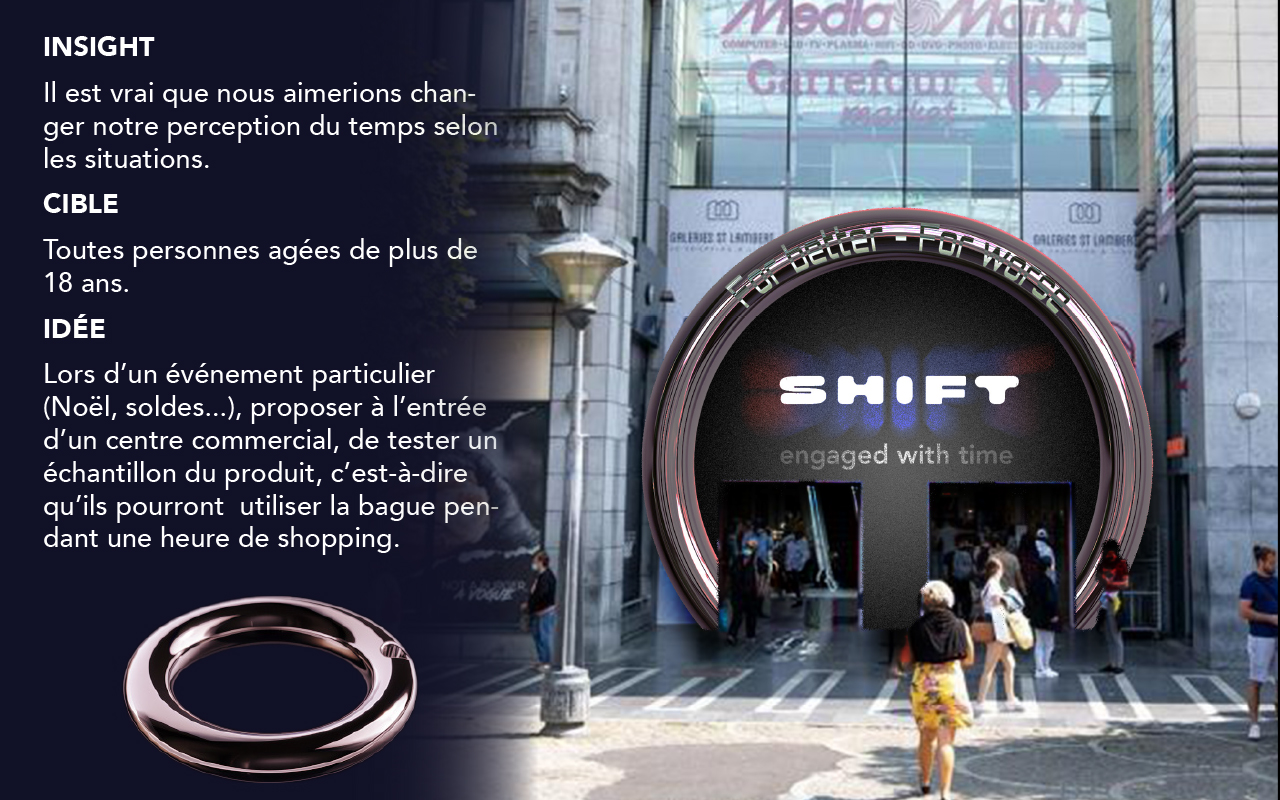
The insight is based on the idea that everyone faces both unpleasant and enjoyable moments, and
sometimes we wish we could adjust our perception of time according to what we are experiencing.
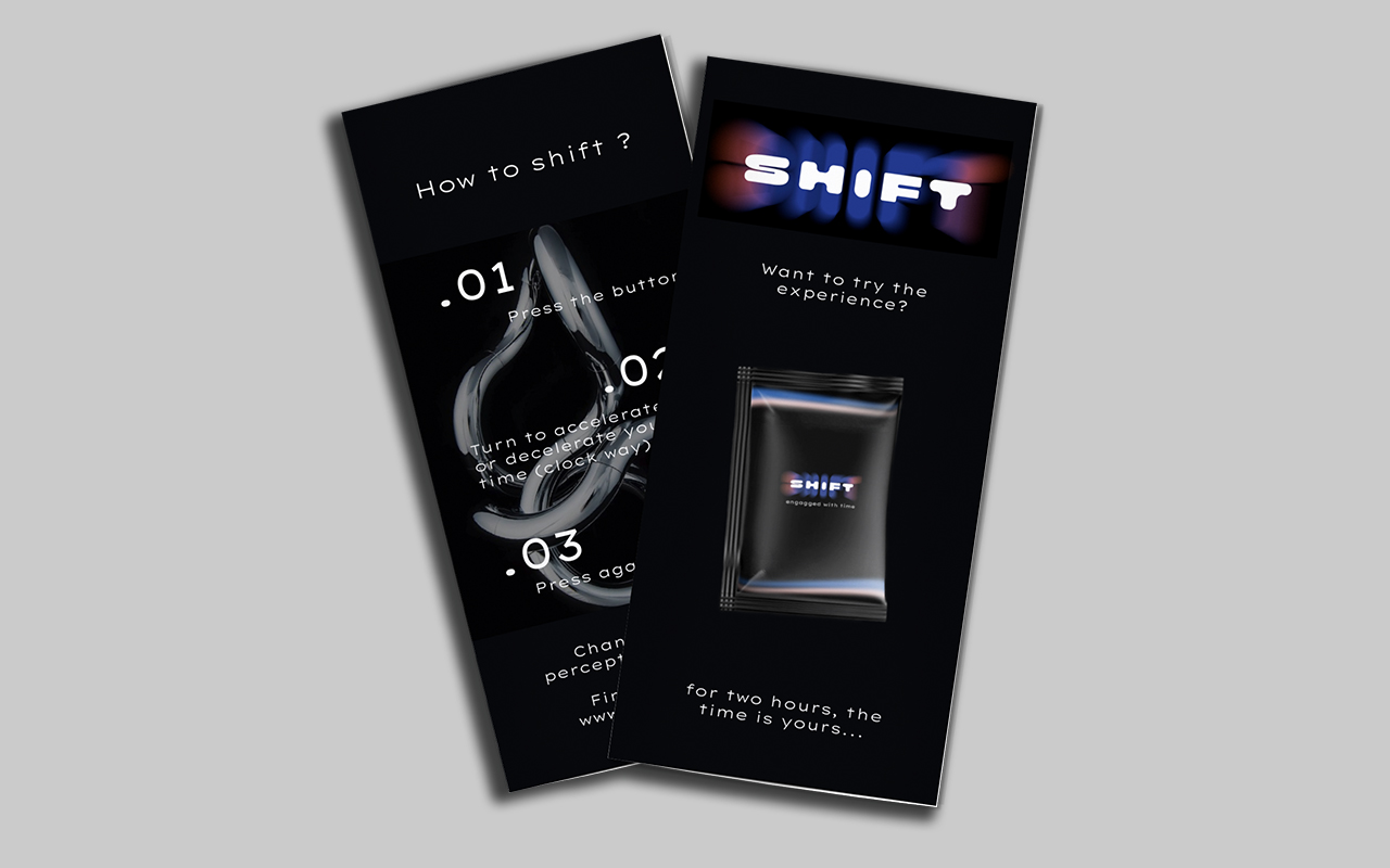
The general idea is to highlight the different situations where our product could be used,
whether to speed
up or slow down our perception of time.
The target audience for this campaign is people aged 18 and
over, who want to either make the most of their time or let it pass by.